
Put five thousand markers on a map and you get a solid block of pins. You can't count them, you can't click the ones underneath, and you certainly can't tell whether one area has twice as many as another. Clustering fixes this — but done carelessly it hides the pattern instead of revealing it.
What clustering does
Nearby points are grouped into a single circle showing how many are inside. Zoom in and clusters break apart into smaller clusters, and eventually into individual markers.
The effect is that the map stays legible at every zoom level. At country level you see a handful of numbered circles; at street level you see individual points; and the transition between them tells you where the density is.
Cluster map vs heatmap
Both handle many points, and people often pick the wrong one.
| You want | Use |
|---|---|
| Countable, clickable individual items | Cluster |
| A smooth impression of density | Heatmap |
| To let people find one specific point | Cluster |
| To show intensity, not identity | Heatmap |
The deciding question is whether individual points have identity. Store locations, incidents with case numbers, properties for sale — these are things people want to click, so cluster them. Anonymous readings where only the aggregate matters — sensor pings, foot-traffic samples — suit a heatmap.
Step 1: Get your points in
Upload a CSV, Excel file, GeoJSON, KML or zipped Shapefile, or connect a Google Sheet for a live source. You need a latitude and a longitude per row; everything else is optional and becomes searchable or filterable later.
Bring your extra columns along — category, status, date, price. The next two sections depend on having them.
Step 2: Make clusters mean something
By default a cluster is a circle with a count, sized and colored by how many points it holds. Small (under 10), medium (10–49) and large (50+) clusters get different colors — and you can set both the three colors and the two breakpoints they step at.
That's fine, but it only encodes one variable: how many.
Donut clusters encode a second. Instead of a flat circle, each cluster renders as a ring segmented by a category column — so a cluster of 60 incidents shows at a glance that it's 40 noise complaints, 15 parking, and 5 other. You get density and composition in the same mark.
To set one up, pick the property to break down by, then define your categories. Categories match by exact values, or by a number range — so you can segment by type, or band a continuous value into "under $250k / $250k–$500k / over $500k". Anything that doesn't match falls into an uncategorized color.
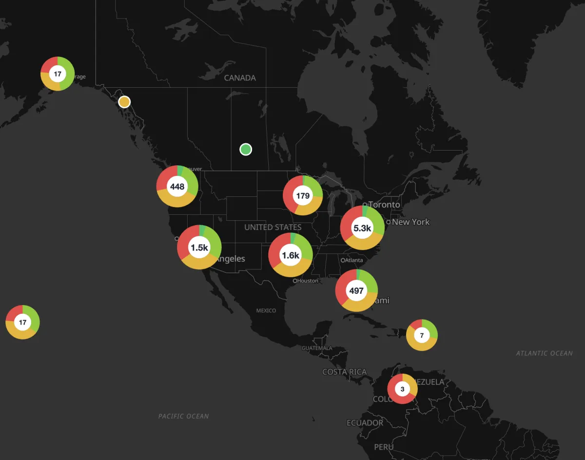
This is the single biggest upgrade available to a cluster map, and it's the reason to bring your category column along at import time.
Use it when the breakdown is genuinely interesting and you have three to five categories. Two is a waste of a donut; eight is a pie chart nobody can read.
Step 3: Handle points at the same address
Clustering breaks down at maximum zoom when several points share a location — three businesses in one building, four incidents at one junction. They stack, and only the top one is clickable.
Spread out overlapping points solves this: with it on, clicking a cluster fans its markers out on short legs so each becomes individually selectable. Turn it on for any dataset where multiple records can share an address. It costs nothing when there are no overlaps.
Step 4: Add search and filters
A cluster map with five thousand points needs a way in. Turn on the search and filter panel and choose:
- Searchable fields — which columns a visitor's text query matches against.
- Filters — dropdown, multi-select, or numeric range, per column.
Filters interact well with clustering: filtering to one category re-clusters the remaining points, so you immediately see the density of just that subset. That's often the most useful view on the whole map, and it's two clicks away.
You can also have matches highlighted and flown to.
Step 5: Style for readability
- Use a quiet basemap. Clusters are bold shapes; a busy base fights them. Grayscale or a light theme works best.
- Set the color thresholds to your data. The defaults band clusters at under 10, 10 to 49, and 50 or more. If your map is mostly clusters of 200, everything renders in the "large" color and the color tells you nothing — move the breakpoints up until the three bands actually split your data. The colour labels update to match, so you can see the bands you've defined.
- Tune the cluster radius. How close together points have to be before they merge, from 20px to 200px. Smaller keeps clusters tight and numerous; larger consolidates them. There's also a zoom level past which every cluster splits into individual markers.
- Name your donut categories well. Turn donut clustering on and a legend appears automatically with those category colors, so the labels you type are what readers use to decode the map — and give the legend a title that says what the rings break down. Plain count clusters get no legend — the number is printed inside the circle, so there's nothing to decode.
- Check the zoomed-out view. That's the first thing visitors see, and it's the view most people forget to look at while editing.
Limits and what to do at scale
Up to 10,000 features per data source, from a file of up to 25 MB.
If you have more:
- Filter to what matters. All 40,000 records is rarely the useful map.
- Aggregate and use a choropleth. If your real question is "which region has more", regional totals answer it better than 40,000 pins ever will.
- Split by category or region into separate maps.
The mistake to avoid
Over-aggressive clustering hides the thing you're trying to show. If your map displays four giant circles at every zoom level until the user is practically at street level, they'll never discover the pattern.
Check the map at the zoom your audience will actually land on — for most embeds that's a regional view, not a world view — and make sure clusters break apart into something informative within a click or two.
Build a cluster map — free to start.