
A heatmap is one of the fastest ways to turn a pile of location data into an answer. Instead of staring at thousands of overlapping pins, you get a smooth gradient of color that shows exactly where activity concentrates. This guide walks through making one online — no code, no GIS software.
What a heatmap is good for
Heatmaps answer the question "where is there more or less of something?" They shine when you have many points and care about density rather than individual locations:
- Foot traffic or sales by location
- Incident or crime density
- Sensor or event readings
- Customer or sign-up concentration
If instead you need to compare predefined regions (states, countries), a choropleth map is the better fit. And if readers need to click a point and find out what it is, you want a cluster map — a heatmap deliberately throws identity away.
Step 1: Gather your point data
You need a row per point with latitude and longitude. A spreadsheet with lat
and lng columns is perfect — nothing else is required.
By default every point counts equally — the heat comes from how many points land close together. That's the right model for raw event data, where each row already is one occurrence.
If your rows carry a magnitude, add a numeric column and map it as the weight. A sales figure, a population, a severity score: higher values burn hotter, scaled across that column's own range so a column in the millions works as well as one in single digits. This is what lets one row represent many things.
The distinction matters most for pre-aggregated data. One row per city with a
visits column, left unweighted, shows you where your cities are rather than
where the visits are — so either weight by visits, or use a
choropleth, which is built for values-per-region.
How many points do you need? More than most people expect. Fifteen points blurred into a gradient implies a smooth surface that fifteen records cannot support. A few hundred is a sensible floor; thousands is where heatmaps genuinely earn their keep.
Coordinates need to be decimal degrees — 41.8902, not 41°53'25"N. Mapji
reads a cell up to the first character that isn't part of a number, so malformed
coordinates tend to plot in the wrong place rather than fail loudly.
Making a map from a CSV or Excel file covers the
full set of coordinate problems and how to spot them after an import.
Step 2: Create a heatmap
In Mapji, start a new site and choose the Heatmap type. Then add your data by uploading the file or connecting a Google Sheet as a live source — when the sheet changes, the map updates automatically, which is what you want for anything ongoing like incident logs or sensor feeds.
Step 3: Tune the gradient
This is where a heatmap goes from noisy to clear, and it's worth more time than the import was:
- Radius controls how far each point spreads. Smaller radius = sharper hotspots; larger radius = smoother surface. This is the single most consequential setting.
- Intensity controls how quickly color saturates. If everything is already red, this is the dial to turn down.
- Color Gradient sets the ramp. There are 10 built in; a cool-to-warm ramp reads as low-to-high almost without explanation.
- Weight by picks the numeric column that decides how much each point contributes. Leave it unset and every point weighs the same.
The heatmap reference lists the range each setting accepts.
The trap with radius is that it doesn't rescale as you zoom. A radius tuned while you're looking at one city will look like a solid blanket at country level, and like scattered dots at street level. Pick the zoom your audience will actually land on — for most embeds that's a regional view — and tune there.
Step 4: Publish or embed
The heatmap is live at mapji.com/map/your-map as soon as you create it. Add a
free yourmap.mapji.com subdomain or your own custom domain if you like, and
embed the heatmap on any page with a single snippet. If the map is going inside
an article, turn off scroll zoom so it doesn't hijack the page as readers scroll
past — embedding an interactive map
covers that and the other embed details worth getting right.
Tips for a readable heatmap
- Re-check the radius at your audience's zoom, not the one you happened to be editing at.
- Don't over-saturate. If everything is red, lower the intensity. A heatmap where the whole map is the hottest color has no information in it.
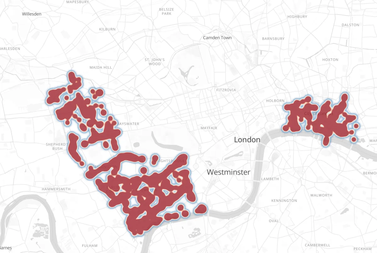
- Use a quiet basemap. A dark or grayscale base makes a warm gradient pop; a busy, colorful base fights it.
- Title the legend. The map carries a Low → High key; give it a title that says what is being counted, so nobody has to guess.
- Say what the data is. "Density of reported incidents, 2024" prevents the most common misreading, which is people assuming a hotspot means severity when it only ever means count.
The honest caveat
A heatmap shows where your data is dense, which is not always where the phenomenon is dense. If reports come mostly from one neighborhood because that's where the reporting app was promoted, the hotspot is a map of your sampling, not of the world. Worth a sentence next to any heatmap built from voluntary submissions.
Ready to try it? Make a heatmap online for free.