
Straight-line distance is a bad proxy for how far away something is. A shop 400 meters away across a highway with no crossing is further, in every sense that matters, than one 900 meters away down a walking path. Isochrone maps measure the thing you actually care about: how far you can get in a given amount of time.
What an isochrone map shows
An isochrone is a line connecting all the points you can reach within the same travel time from a starting location. Draw one at 10 minutes and it encloses everywhere within a 10-minute journey; draw several at 5, 10, and 15 minutes and you get nested bands — a travel-time contour map.
The shape is never a circle. It stretches along fast roads and rail lines, pinches at rivers and rail crossings, and reaches barely at all into cul-de-sacs and hillsides. That gap between the circle you'd have drawn and the shape you actually get is the entire value of the technique.
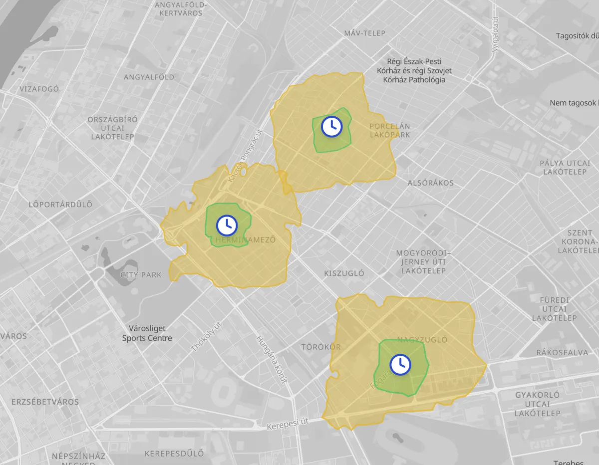
The word comes from the Greek iso (equal) and chronos (time) — a line of equal time, in the same way a contour is a line of equal elevation.
Isochrone vs isodistance
The two get conflated, and they answer different questions.
- An isochrone bands by time: everywhere within a 15-minute drive.
- An isodistance bands by distance traveled along the network: everywhere within 5 km of road travel.
Time is usually what you want, because it accounts for speed limits and road type — 15 minutes on a freeway covers far more ground than 15 minutes through a town center. Distance is the better choice when the constraint is genuinely physical: delivery cost per kilometer, the range of an e-bike, a walking distance policy written into a planning rule.
Mapji draws either. You choose time or distance when setting the ranges.
What people use them for
Site selection. Before signing a lease, draw a 10-minute drive-time catchment and check what's actually inside it. Two candidate units a mile apart can have wildly different reach.
Accessibility and coverage analysis. How much of the town is within a 15-minute walk of a pharmacy, a school, or a bus stop? Overlapping isochrones from several sites show both the gaps and the redundancy.
Service areas. Publishing an honest "we deliver within 30 minutes" map beats a hand-drawn circle that promises places you can't reach.
Property listings. "12 minutes from the station on foot" is a far more persuasive claim than a distance, and an isochrone shows the buyer exactly which homes qualify.
Emergency planning. Response-time coverage is the classic use, and the one the technique was invented for.
Choosing a travel mode
Mapji supports four, and the shapes differ enormously:
- Walking — roughly circular but interrupted by rivers, railways, and highways with no crossing. Reveals severance in a way nothing else does.
- Cycling — larger, follows the road and path network, and is sensitive to whether cycle infrastructure connects up.
- Driving — the most elongated, stretched hard along fast roads.
- Public transit — the strangest looking, and the most informative. Reach clusters around stations and stops rather than spreading evenly, so the polygon often arrives in disconnected islands.
Always match the mode to the actual behavior you're modeling. A city-center café should be analyzed on foot and by transit; a big-box retail site by car.
Building one
- Create an isochrone map — listed as Travel Time Map in the app — and place your starting point on the map. You can place up to 5 starting points on one map — enough to compare a shortlist of candidate sites, or show coverage from several depots at once. Importing a file works too: tick the rows you want as starting points.
- Pick the travel mode — walk, bike, car, or transit.
- Choose time or distance, then set your ranges — pick presets or type your own, such as 20 minutes. Three nested bands read better than one; five starts to look muddy.
- Style and publish, then embed it on your site.
Because each origin can carry its own name and description, a multi-origin map doubles as a comparison: click each marker to see which site it belongs to.
Reading them honestly
A few caveats worth stating, because isochrones look more precise than they are:
- They're modeled, not measured. Travel times come from a road network model, not from tracking real journeys.
- Traffic varies. A drive-time catchment at 3pm on a Tuesday is not the same one as 8am on a Monday. If timing matters to your decision, say which assumption you're showing.
- The edge is not a wall. Someone just outside a 15-minute band is not meaningfully worse off than someone just inside it. Nested bands communicate this better than a single hard boundary.
- Transit isochrones depend on the timetable. Reach at 9am and reach at 11pm are different maps.
When something else is a better fit
If you want to show where your customers are rather than where you can reach, that's a heatmap or cluster map question. Isochrones are about accessibility from a point, not the distribution of the points themselves. The ten map types explained walks through the whole set if you're still deciding.
The two pair well: a heatmap of demand with an isochrone of your coverage drawn over it shows immediately whether the two overlap.
Build a travel-time map — free to start, no code required.