
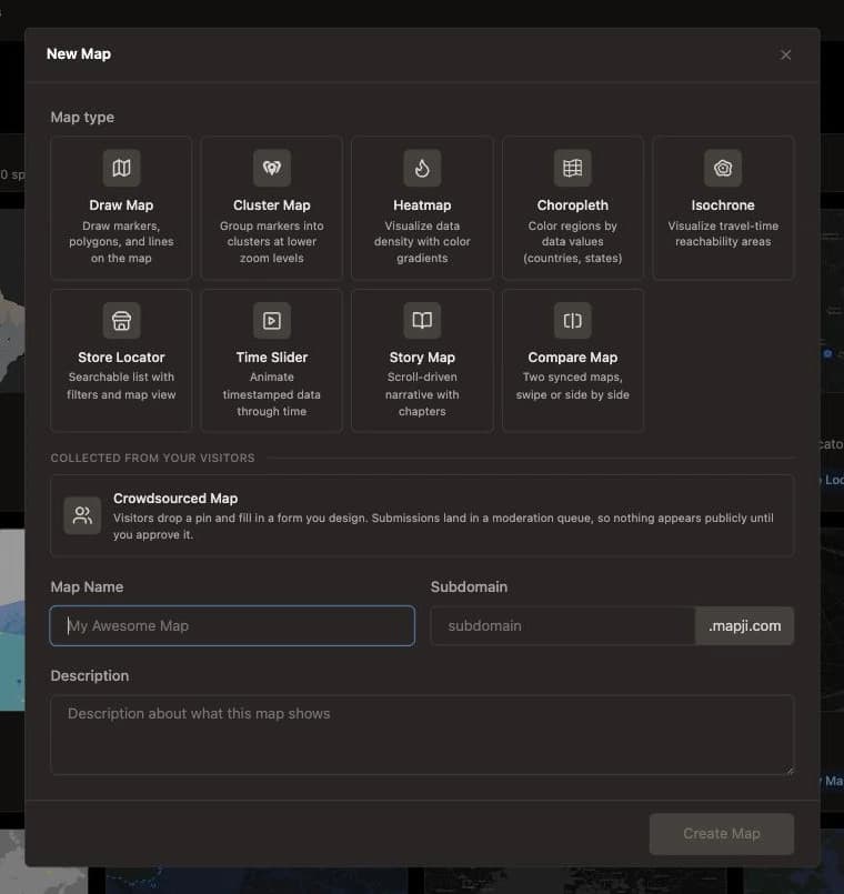
Most bad maps are the right data in the wrong form. A heatmap of twelve offices, a choropleth of individual incidents, five thousand pins with no clustering — each is a mismatch between the shape of the data and the shape of the visualization. This guide walks through ten map types and what each is actually for.
Start with two questions
Before picking a type, answer these:
- Is your data points or regions? A row per place with coordinates is points. A row per country, state, or district with a value is regions.
- Do individual records have identity? Does a viewer want to click one and find out what it is — or do only the aggregate patterns matter?
Those two questions eliminate most of the list immediately.
Quick reference
Each map type links to its reference page, which lists every setting.
| Your data | Your question | Map type |
|---|---|---|
| Points, few, hand-placed | Where are these specific things? | Draw |
| Points, many, individually meaningful | Where are they, and what is each? | Cluster |
| Points, many, anonymous | Where is it dense? | Heatmap |
| Values per region | How do regions compare? | Choropleth |
| One or more origins | What's reachable from here? | Isochrone |
| Points people need to find | Which is nearest and open? | Store locator |
| Points with dates | How did this change over time? | Time slider |
| A sequence of places with a narrative | What's the story here? | Story map |
| Data that doesn't exist yet | What do people out there know? | Crowdsourced map |
| Two datasets, one place | What changed between them? | Compare |
The ten types
Draw map
Sketch markers, lines, and polygons straight onto the map. No dataset required — you're creating the data by drawing it.
Use it for annotating a location, outlining a service area or site boundary, or building a small custom map by hand. It also draws real routes: list up to ten stops — searched by address or clicked on the map — pick a travel mode, and the path follows the actual road network, arriving as an editable line with its distance and travel time. Imported features land on the canvas alongside whatever you have already drawn, rather than replacing it, so it's a natural place to trace over a GPS track or a Google Earth export.
Don't use it for anything with more than a few dozen features, or anything that will change regularly — that's a data-driven type's job.
Cluster map
Groups nearby points into numbered circles that split apart as you zoom.
Use it for any point dataset from a few hundred to ten thousand records where individual entries matter. It's the safest default for point data. Donut clusters add a second dimension by breaking each cluster down by category, which is often the most informative single view you can build.
Heatmap
Blends points into a continuous color surface showing density.
Use it for intensity and concentration where individual points are anonymous: incident density, foot traffic, sensor readings, activity concentration.
Don't use it for small datasets. A heatmap of fifteen points is a Rorschach test — it implies a smooth surface that fifteen records cannot support.
Choropleth map
Shades predefined regions by a value.
Use it for anything already aggregated per region: census data, election results, sales by territory, incidence rates. Boundaries are built in for countries, states and provinces, counties, and European NUTS regions, and your data joins by name or standard code.
The classic mistake is shading by raw count rather than by rate. Count maps mostly show you where the people are — big regions look important because they're big. Normalize per capita or per area.
Isochrone map
Shows everywhere reachable within a given travel time or distance from a starting point.
Use it for site selection, catchment analysis, accessibility studies, and honest service-area maps. Walking, cycling, driving, and public transit each produce very different shapes, and up to five origins can share one map.
Store locator
A searchable, filterable list of locations beside the map, with distance sorting.
Use it for anything a visitor needs to find rather than understand: branches, dealers, stockists, clinics, pickup points. It's the only type built around a sidebar list, because finding is a list task as much as a map task. Opening-hours badges answer "is it open now" without making anyone read a table.
Add opening hours and open-now badges →
Time slider map
Animates points across a timeline that visitors can play and scrub.
Use it for anything where the change over time is the point: outbreak spread, construction progress, migration, expansion of a network. Earlier positions can stay on the map behind the current one, fading with age, so movement reads as a trail rather than a jump.
Requires a date or timestamp column. It does not need to be rounded first — steps can be one per distinct value, or grouped into calendar periods from hourly to yearly, which is what keeps a column of exact timestamps from becoming a slider with one notch per row. Inconsistent date formats within the one column are still the main reason these don't work first time.
Story map
One continuous map that flies between locations as the reader scrolls, with text and images alongside.
Use it for narrative: journeys, expeditions, investigations, guided tours, the history of a place. The continuity is the point — readers see the relationship between chapters, which a slideshow throws away.
Don't use it for anything exploratory. It sets the pace deliberately.
Crowdsourced map
Visitors drop a pin and fill in a form; you moderate the submissions before they appear.
Use it for data that doesn't exist yet — civic reporting, community directories, citizen science, place-based competitions. The moderation queue is what makes public contribution workable rather than a defacement risk.
Compare map
Two maps of the same place, locked to the same camera, with a divider you drag across to reveal one under the other — or a split screen giving each its own half.
Use it for a question about difference rather than distribution: land use in two years, coverage from two providers, a proposal against what stands today, satellite imagery against a street map. Each side takes its own file and draws it its own way, so a heatmap on one side against raw geometry on the other is a normal setup.
Don't use it for a single dataset. If both sides would show the same thing, you want one map with better styling. It also can't be driven by Google Sheets — a sync pairs one map with one spreadsheet, and this type holds two.
Common mismatches, and the fix
Too many pins. Switch to clustering, or to a heatmap if identity doesn't matter.
A heatmap that's all one color. Either too few points, or the intensity is too high. Check the count first.
A choropleth where one region dominates. You're mapping counts. Switch to a rate.
A store locator nobody uses. Usually missing search, filters, or Near Me — the map is fine, the finding tools aren't there.
A story map people abandon halfway. Chapters are too long. If a reader has to scroll twice inside one chapter, the map sits still and the effect dies.
You can build more than one
The fastest way to settle an argument about which visualization to use is to build both from the same file. Points can go into a cluster map and a heatmap; regional aggregates can go into a choropleth alongside either. It takes minutes, and the right answer is usually obvious once you're looking at both.
If you're here because a pin map isn't enough anymore, the related question is which tool to build it in — choosing a Google My Maps alternative covers what actually forces a switch.
Start building — free, no code required.