Popups
Design what appears when a visitor clicks or hovers over a feature, and share a link that opens one feature.
A popup is what opens when a visitor selects a feature on the map. On Draw, Cluster, Heatmap, Choropleth, Time Slider, Crowdsourced and Compare maps, features have a built-in popup that lists their details, and you can design it instead: choose the title, a photo, a sentence built from your columns, the rows and their formats, and buttons.
Store Locators use their location cards instead, an Isochrone map shows each starting point's name and description, and Story Maps have no popups.
Design a popup
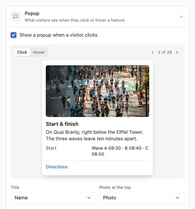
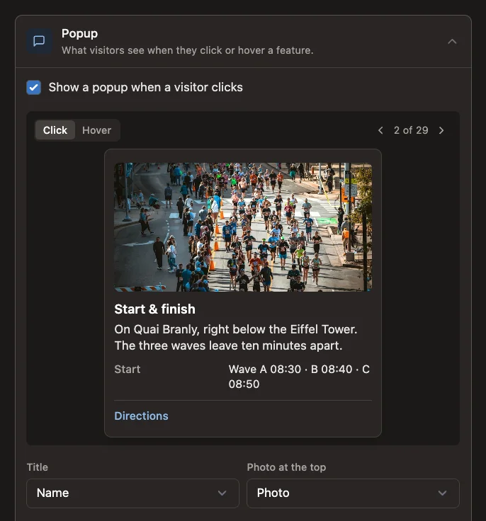
Open Settings → Popup (on a Crowdsourced Map, Display → Popup) and select Customize popup. Mapji starts you off with a title and the first few fields; a live preview at the top of the section uses a real feature from your data.
| Setting | What it does |
|---|---|
| Show a popup when a visitor clicks | Turn off for no popup at all |
| Title | Automatic (name or title), or any column |
| Photo at the top | A column holding an image address, shown as a header |
| Text | A sentence built from your columns, such as Built in {year} · **{rooms}** rooms — see below |
| Rows | Up to 30 fields, each with a label and a format. Empty values are skipped. |
| Layout | Label above value or Label beside value |
| On hover | Nothing, A tooltip with the title (Region and value on a Choropleth map, where it is the default), or The whole popup. Touch screens have no hover, so a tap opens the popup. |
| Directions | A button that opens directions to a point, in Google Maps or, on an iPhone, Apple Maps. Not on Choropleth maps. |
| Copy link | A button visitors use to copy a link that opens the map on this feature. Not on Compare maps. |
Reset to the built-in popup goes back to the default. The design is saved with the editor's Save.
Text with fields
The Text box takes up to 1000 characters. Put a column's name in braces to insert its value, for example {year}, or pick one from Insert field…. Wrap words in double asterisks for bold. A field that has a row uses that row's format. A line whose fields are all empty is left out, so one text works for features with and without the details.
Row formats
| Format | Shows the value as |
|---|---|
| Text | Plain text |
| Number | A number, with a choice of decimals, a thousands separator, and short forms such as 1.2K |
| Currency | An amount with a currency code such as EUR |
| Percent | A percentage; tick Values are fractions (0.25 = 25%) if your data stores 25% as 0.25 |
| Date | A formatted date |
| Link | A link, with your own link text, or as a button |
| Image | An image |
| A link that opens an email | |
| Phone | A link that dials the number |
Each row can also add text before and after the value (such as approx. or m²), or hide its label.
Links and images must be web addresses starting with https:// or http:// (a bare address such as example.com/menu gets https:// added). Anything that isn't a valid address, email or phone number is shown as plain text, never as a link.
Link to one feature
With Copy link on, the popup gets a button that copies a link to that feature. Opening the link opens the map on the feature, with its popup showing — on a Time Slider map, at the feature's step. The link works on the published map and its addresses, not inside the editor.
Store Locators have the same option under Details & sharing → Copy link: the link opens the location in the panel.
On a Crowdsourced Map
The popup only opens when Public visibility is Pins + details, and can only show the fields you publish under Public fields. See Crowdsourced Map.